Orfium Corporate
A complete brand and corporate website redesign for Orfium, a leader in music rights management and technology, following their major rebranding initiative.
Following a major rebranding initiative, Orfium's corporate website needed a complete redesign to reflect the company's evolved identity and expanded service offerings in the music technology space. The project encompassed both the visual brand refresh and the full site redesign.
The redesign focused on creating a modern, visually compelling experience that clearly articulated Orfium's value propositions to music publishers, production music companies, record labels, and other industry stakeholders. Custom illustrations were developed to bring warmth and personality to the brand, while the site architecture was restructured for better content discoverability.
One Brand, Many Audiences
Orfium serves a diverse ecosystem within the music industry, from major music publishers and production music companies to collecting societies, broadcasters, digital service providers, and record labels. Each audience has distinct needs, pain points, and decision-making criteria.
The challenge was to create a unified brand experience that speaks credibly to all six audience segments while maintaining a coherent visual identity. The site needed to balance corporate gravitas with approachability, technical depth with clarity, and scale with personality.
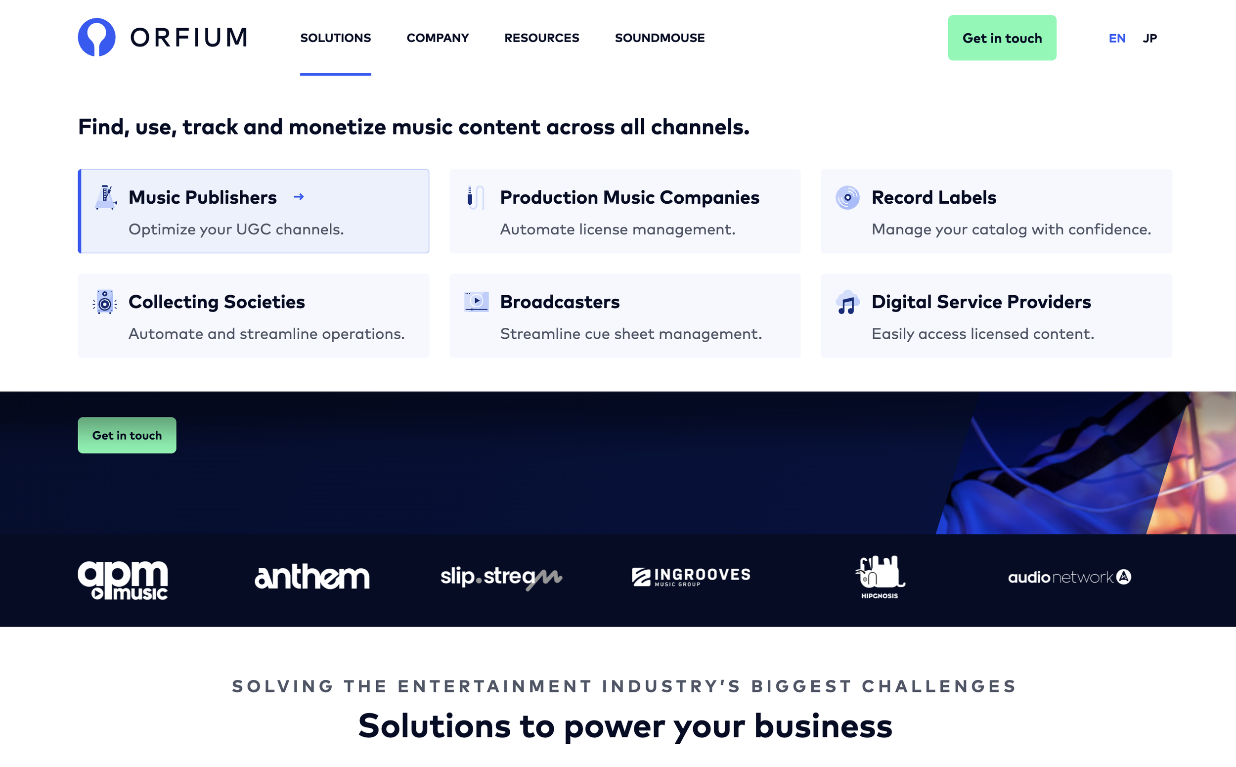
Homepage Experience
The homepage was designed as a gateway that immediately communicates Orfium's breadth of services while guiding each audience segment to their dedicated landing page through clear, card-based navigation.
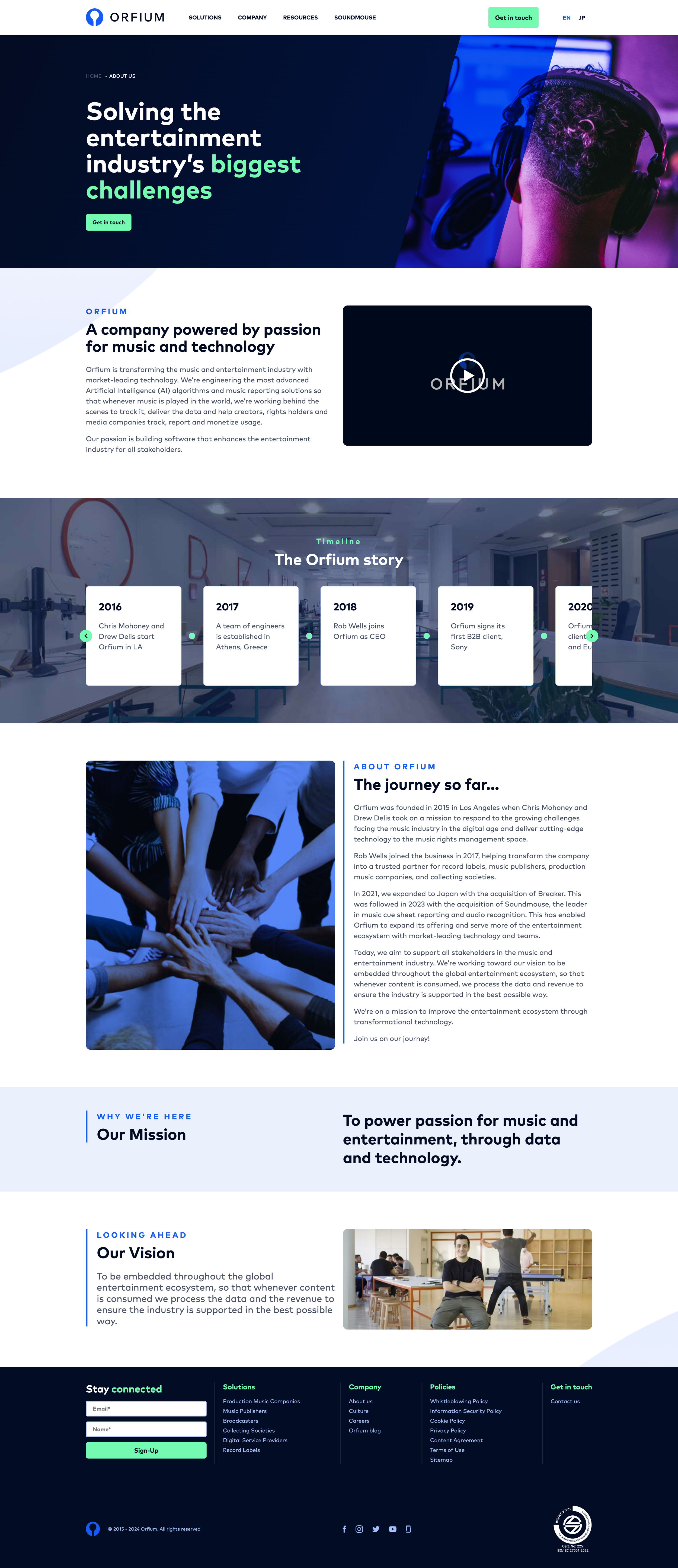
Telling the Orfium Story
The About page was designed to humanize a technology company. Rather than listing achievements, the page tells a narrative, from Orfium's founding mission to its current position as a music industry leader. Rich editorial layouts with custom illustrations create an emotional connection that data sheets alone can't achieve.
Key sections include the company's history, leadership team, global offices, and core values, all structured to build trust with potential partners and clients.
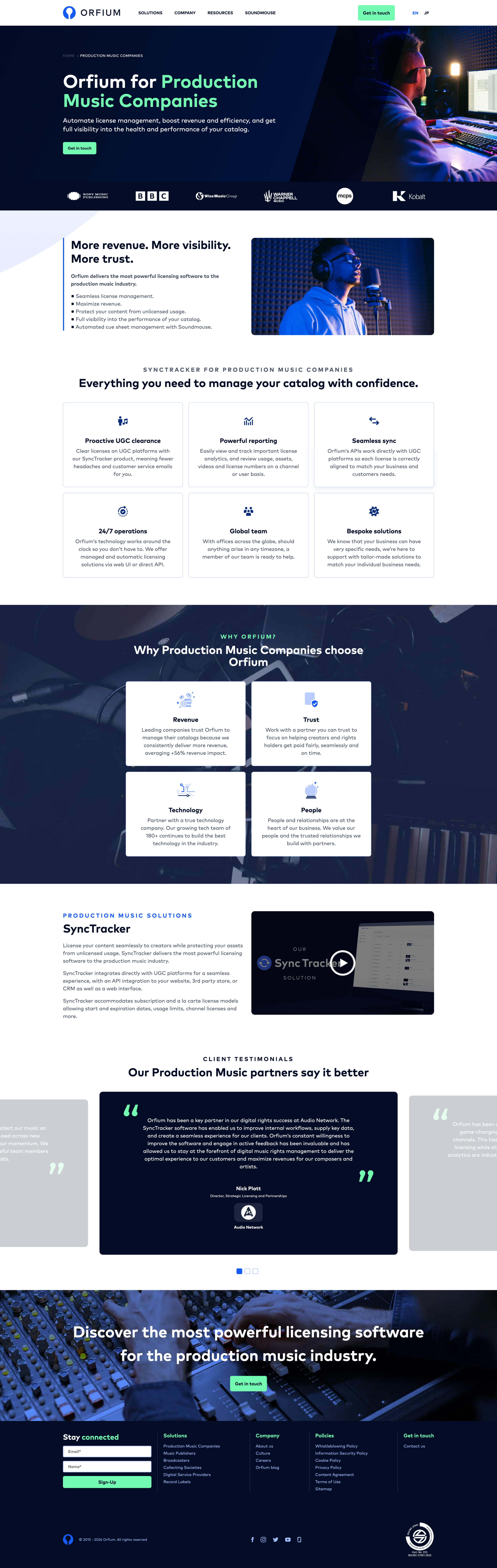
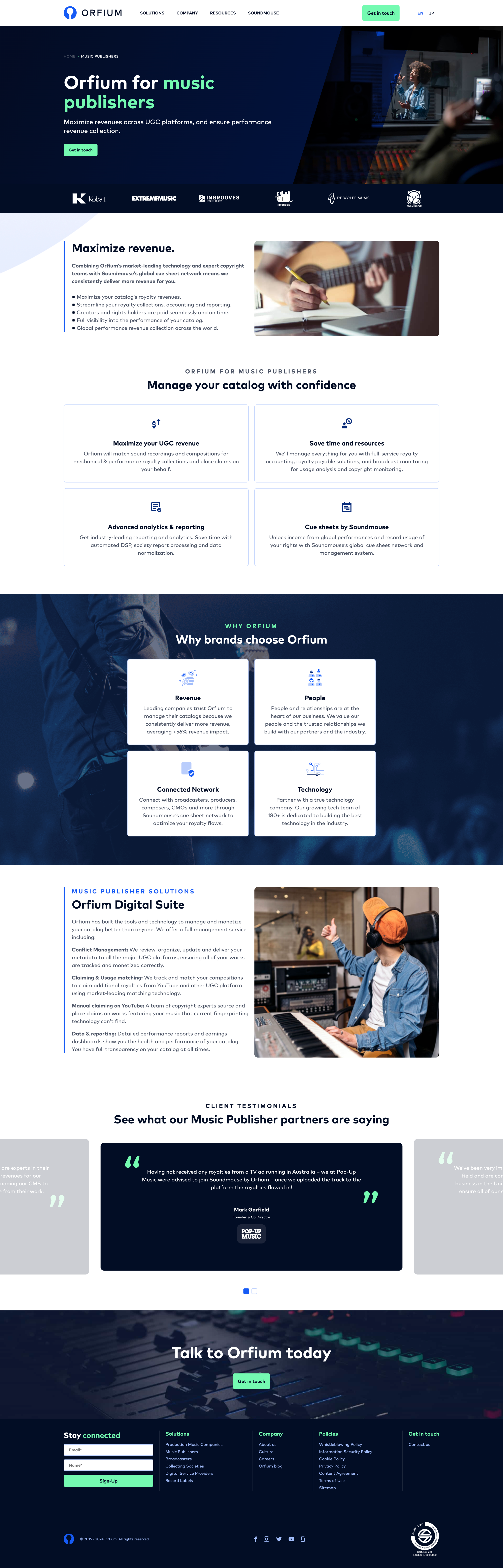
Targeted Product Pages
Each audience segment gets a dedicated product landing page that speaks directly to their industry challenges. The production music companies page, for example, focuses on license management automation, the exact pain point this audience needs solved.
The page structure follows a consistent pattern across all segments: hero with value proposition, feature breakdown with illustrations, social proof from existing clients, and a clear call-to-action. This templated approach ensures consistency while allowing each page to feel tailored.
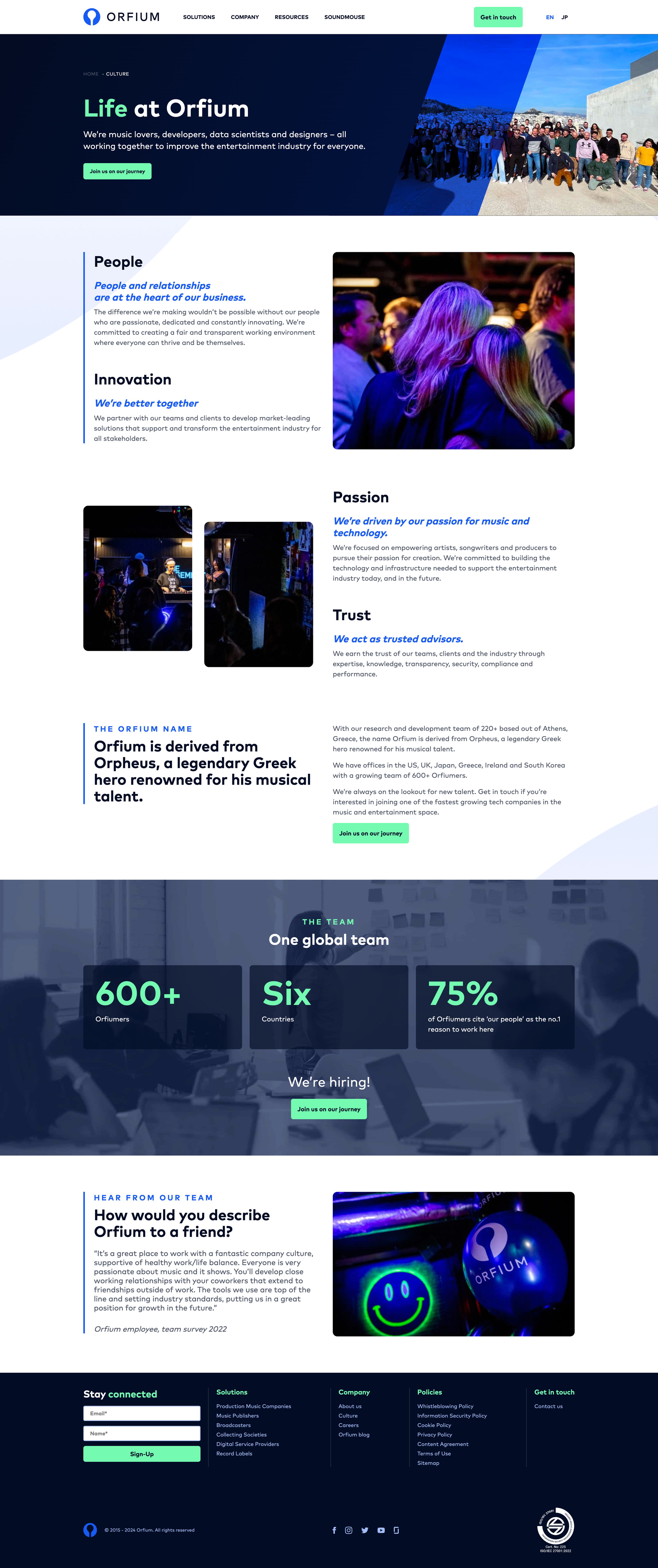
Culture & People
Orfium's culture page was designed to attract top talent by showcasing what it's like to work at the company. The page features team photos, office life, company values in action, and employee testimonials, all presented in a warm, editorial style that contrasts with the more technical product pages.
This balance between corporate professionalism and human authenticity was critical. The design system needed to accommodate both data-driven product narratives and emotion-driven culture storytelling within the same visual language.
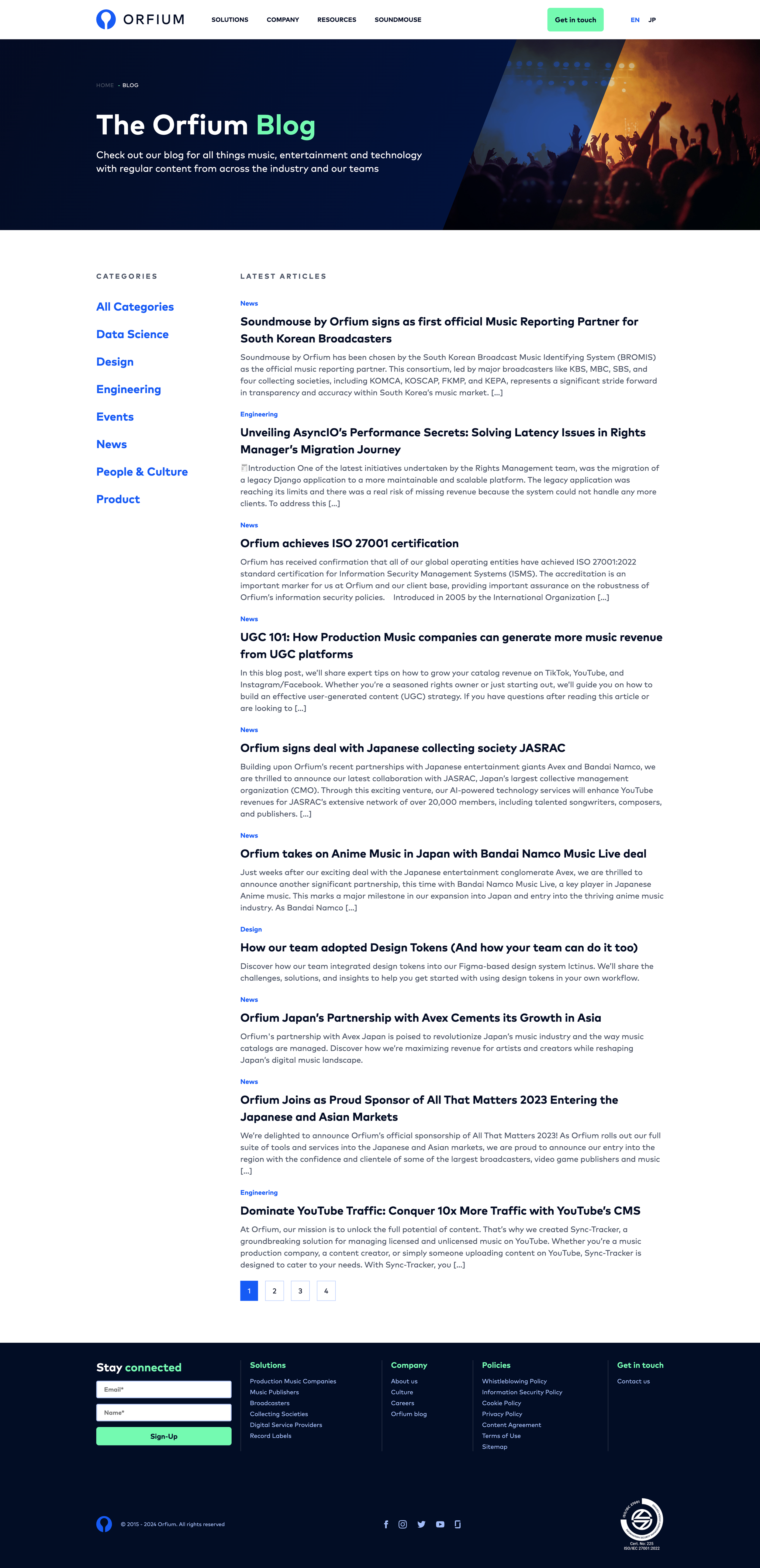
Blog & Content Hub
The blog serves as Orfium's thought leadership platform, a space for industry insights, product updates, and company news. The layout was designed for scanability: clear typography hierarchy, card-based article previews, and category filtering.
Design Language
A visual system built to bridge the gap between music industry credibility and modern tech approachability.
Color Palette
A deep navy base with vibrant purple and teal accents gives Orfium a distinctive identity in the music-tech space. The palette transitions smoothly between light corporate sections and dark immersive product showcases.
Custom Illustrations
Bespoke illustrations were created for each service page, adding warmth and visual storytelling that differentiates Orfium from sterile enterprise competitors. Each illustration reflects the specific audience segment's world.
Modular Layout System
A flexible component system with cards, hero sections, feature grids, and testimonial blocks allows rapid page creation. Each module follows strict spacing and type rules while accommodating diverse content types.
All Pages
Reflection
The Orfium redesign was a masterclass in stakeholder alignment. With six distinct audience segments, every design decision was a negotiation between specificity and universality. The breakthrough came when we stopped trying to make one page speak to everyone and instead created a system of interconnected, audience-specific experiences unified by a shared design language.
The custom illustrations became the emotional glue of the brand; they transformed what could have been a sterile enterprise site into something with genuine personality. In the music industry, where relationships matter as much as technology, that warmth makes all the difference.